 So, I was about to briefly touch upon this jazz-pop compilation exemplifying and showcasing the visual interpretation of music, or in their words, “The Physiological and Psychological Applications of Music” until I started reading the blurb on the front cover. This is some fascinating shit! So please bear with me as I transcribe this captivating write-up. I hope you enjoy. (Year unknown. Cat. #H-I (1) 35A. Released by MUZAK.)
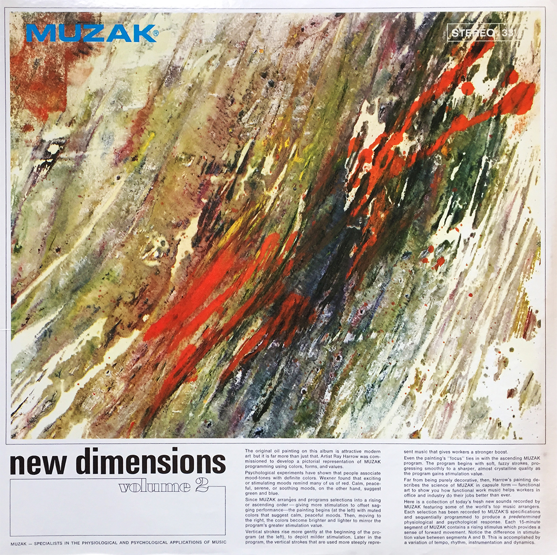
MUZAK – SPECIALISTS IN THE PHYSIOLOGICAL AND PSYCHOLOGICAL APPLICATIONS OF MUSIC
The original oil painting on this album is attractive modern art but it is far more than just that. Artist Ray Harrow was commissioned to develop a pictorial representation of MUZAK programming using colors, forms, and values.
Psychological experiments have shown that people associate mood-tones with definite colors. Wexner found that exciting or stimulating moods remind many of us of red. Calm, peaceful, serene, or soothing moods, on the other hand, suggest green and blue.
Since MUZAK arranges and programs selections into a rising or ascending order – giving more stimulation to offset sagging performance – the painting begins (at the left) with muted colors that suggest calm, peaceful moods. Then, moving to the right, the colors become brighter and lighter to mirror the program’s greater stimulation value.
Vertical strokes rise more gently at the beginning of the program (at the left), to depict milder stimulation. Later in the program, the vertical strokes that are used more steeply represent music that gives workers a stronger boost.
Even the painting’s “focus” ties in with the ascending MUZAK program. The program begins with soft, fuzzy strokes, progressing smoothly to a sharper, almost crystalline quality as the program gains stimulation value.
Far from being purely decorative, then, Harrow’s painting describes the science of MUZAK in capsule form – functional art to show you how functional work music helps workers in office and industry do their jobs better than ever.

What is with that guy?