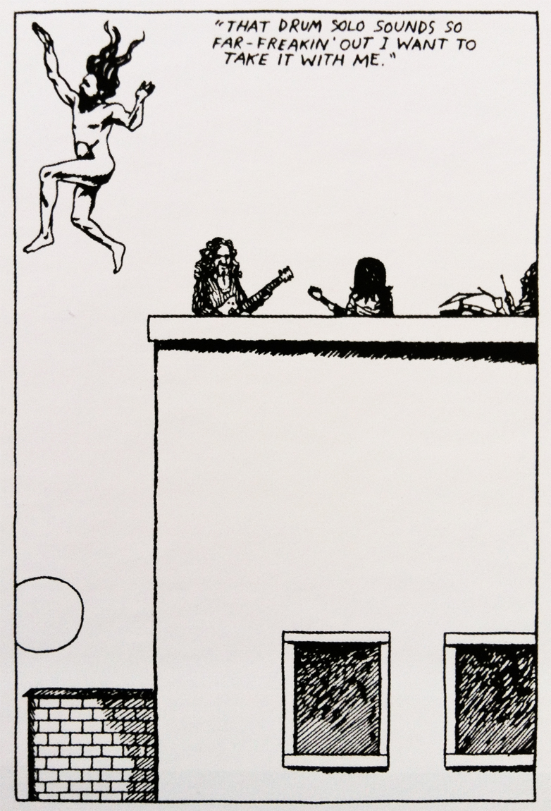
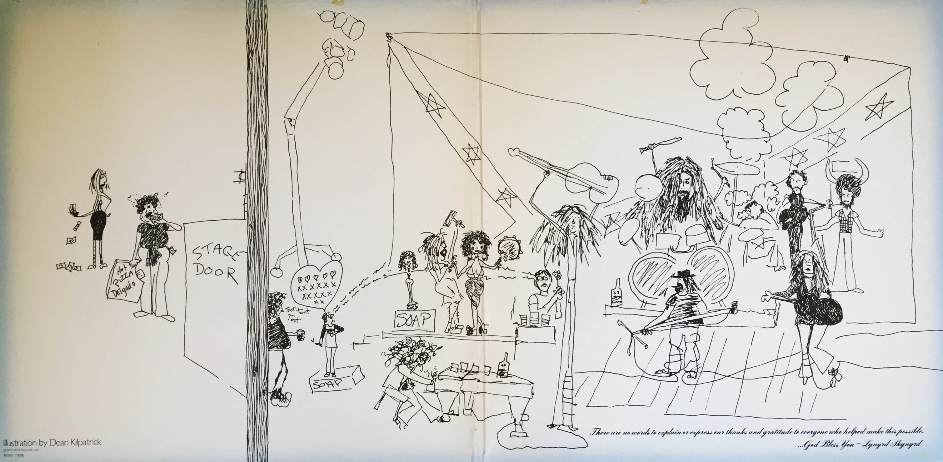
 Presented here, with little-to-no creative description (read: little-to-no sizable effort) is a snapshot illustration of the mighty Lynyrd Skynyrd making southern rock mythical music. Art is by Dean Kilpatrick, and it can be found within the pried bowels of the band’s 1979 best-of, Gold & Platinum. Carry on.
Category Archives: Focus on Art
Todd
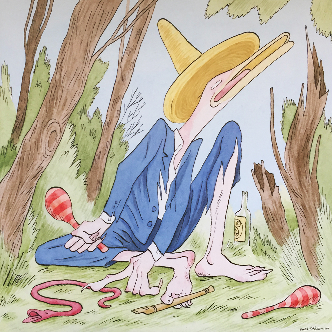 Presented here is an original piece by Norwegian designer Bendik Kaltenborn. It appears inside the 2014 disco record, It’s Album Time by Terje Olsen, aka Todd Terje. In addition to the album’s cover, back jacket, and insert, Kaltenborn has produced illustrations for The New Yorker magazine, as well as a slew of other Todd Terje record releases (The Big Cover-Up and the 12″ single Spiral come to mind). Check him out. He’s certainly a name to remember.
74/82-3
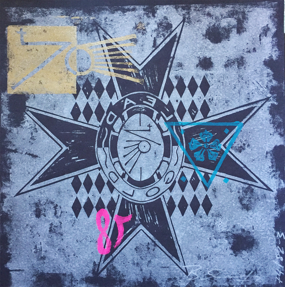 Pre-orders of the latest single from Lead Into Gold (aka Paul Ion Barker) came with this numbered and signed screen printing. It’s good to see the 30+ year old logo is prominently showcased front and center. According to my online sources (Paul Barker’s Facebook page), there are three sets of 82 prints. Mine reads 74/82-3, which means it’s 74 of 82 from the third set. Little pleases me more than to see a 59-year-old Industrial rock icon rehashing an obscure handle which now spans three decades. I look forward to more from this legendary musician.
Miles and Miles of Decisions aka Help Me Make a Decision
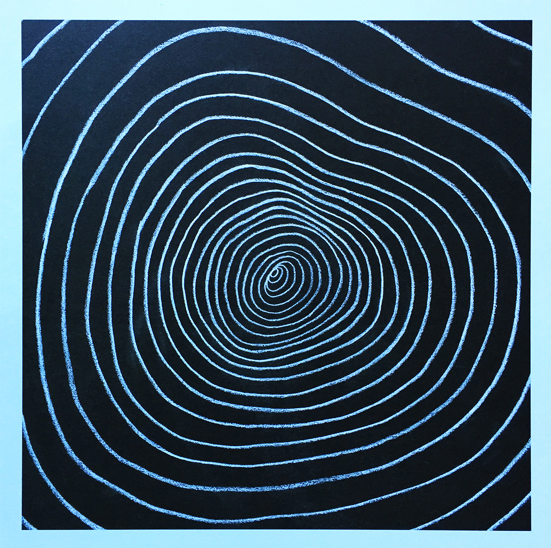 So I’m contemplating, debating really, about discontinuing my Vinyl Me, Please subscription. For a few reasons, really, but mainly because my personal wantlist is so vast and varied, I feel the $30 / month price tag can be better suited on other, needed releases. That being said, I just received Miles Davis’ 1967 Sorcerer last night, this month’s Vinyl Me, Please release, and I instantly fell in love with the minimalist art by Santiago Carrasquilla (an art print and drink pairing come with each month’s record, for those of you unfamiliar with VMP). The debate to stay a subscriber was predominantly one-sided, until I saw this print. Most exceedingly frame-worthy, this print is single-handedly forcing another thoughtful evaluation of this monthly service. To be continued, I suppose…
SPECIALISTS IN THE PHYSIOLOGICAL AND PSYCHOLOGICAL APPLICATIONS OF MUSIC
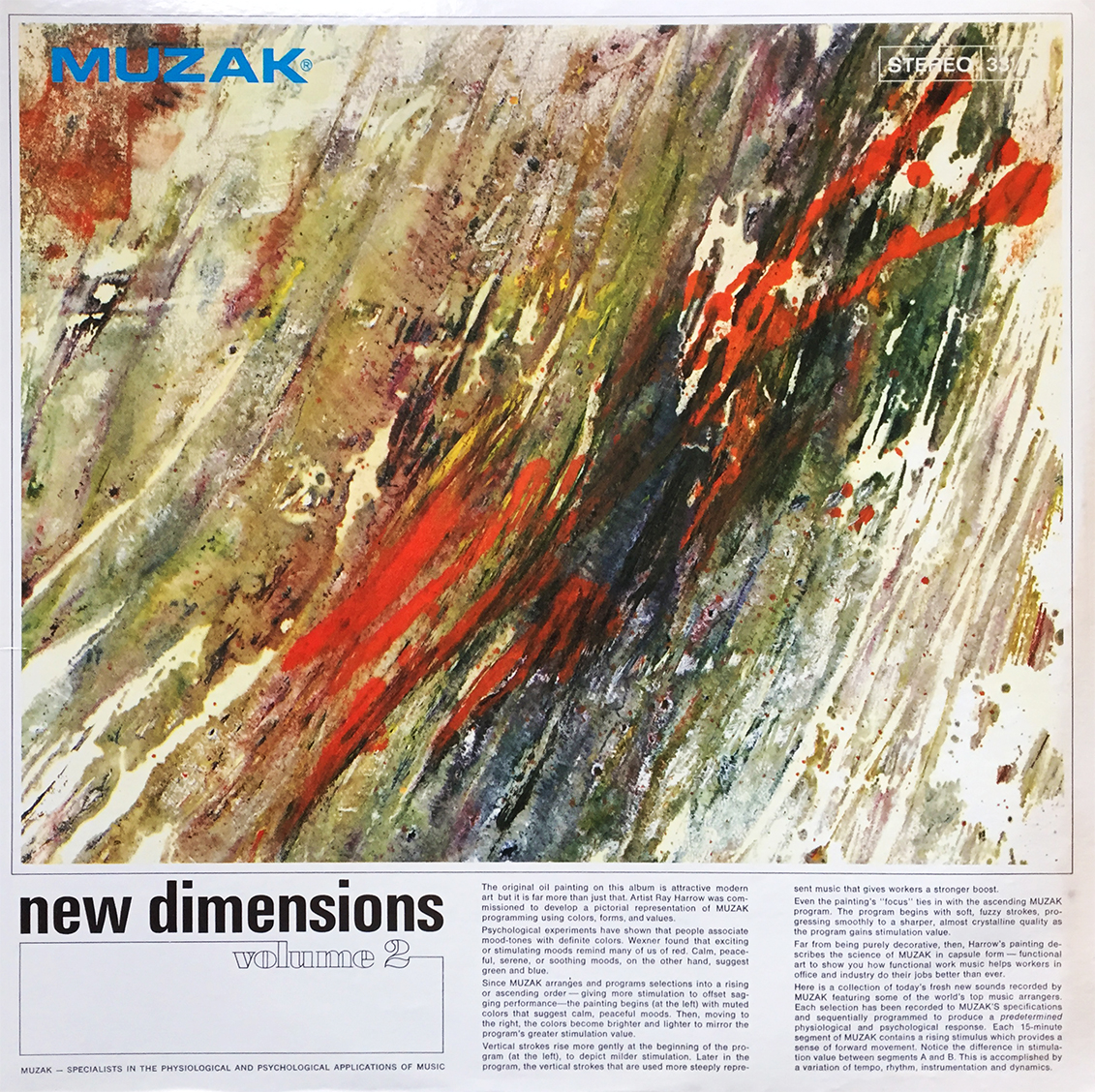 So, I was about to briefly touch upon this jazz-pop compilation exemplifying and showcasing the visual interpretation of music, or in their words, “The Physiological and Psychological Applications of Music” until I started reading the blurb on the front cover. This is some fascinating shit! So please bear with me as I transcribe this captivating write-up. I hope you enjoy. (Year unknown. Cat. #H-I (1) 35A. Released by MUZAK.)
New Dimensions Volume 2
MUZAK – SPECIALISTS IN THE PHYSIOLOGICAL AND PSYCHOLOGICAL APPLICATIONS OF MUSIC
The original oil painting on this album is attractive modern art but it is far more than just that. Artist Ray Harrow was commissioned to develop a pictorial representation of MUZAK programming using colors, forms, and values.
Psychological experiments have shown that people associate mood-tones with definite colors. Wexner found that exciting or stimulating moods remind many of us of red. Calm, peaceful, serene, or soothing moods, on the other hand, suggest green and blue.
Since MUZAK arranges and programs selections into a rising or ascending order – giving more stimulation to offset sagging performance – the painting begins (at the left) with muted colors that suggest calm, peaceful moods. Then, moving to the right, the colors become brighter and lighter to mirror the program’s greater stimulation value.
Vertical strokes rise more gently at the beginning of the program (at the left), to depict milder stimulation. Later in the program, the vertical strokes that are used more steeply represent music that gives workers a stronger boost.
Even the painting’s “focus” ties in with the ascending MUZAK program. The program begins with soft, fuzzy strokes, progressing smoothly to a sharper, almost crystalline quality as the program gains stimulation value.
Far from being purely decorative, then, Harrow’s painting describes the science of MUZAK in capsule form – functional art to show you how functional work music helps workers in office and industry do their jobs better than ever.
Here is a collection of today’s fresh new sounds recorded by MUZAK featuring some of the world’s top music arrangers. Each selection has been recorded to MUZAK’S specifications and sequentially programmed to produce a predetermined physiological and psychological response. Each 15-minute segment of MUZAK contains a rising stimulus which provides a sense of forward movement. Notice the difference in stimulation value between segments A and B. This is accomplished by a variation of tempo, rhythm, instrumentation and dynamics.
That Time Vinyl Me, Please Made Right
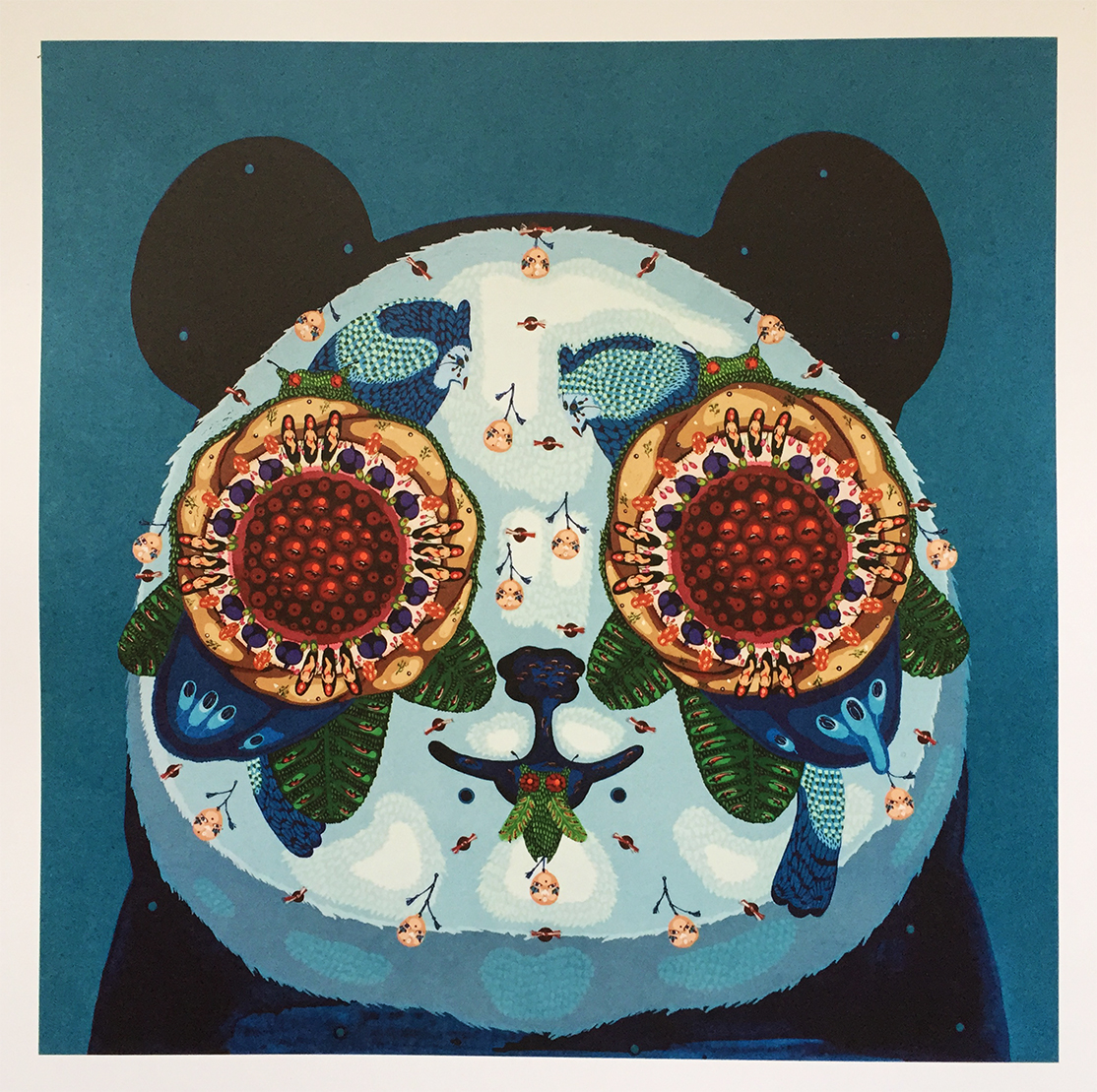 So, quick story. I’m a member of Vinyl Me, Please, and outstanding record-a-month club that you should most certainly check out if you aren’t already a member. Well, last month’s double LP was Panda Bear’s Person Pitch, and instead of getting disc 1 and disc 2, what one would assume, I got 2x disc 1s. It actually took me a song to realize when I put the 2nd record on the platter. Anyway, I took a photo of my bastardized album, send it to Vinyl Me, Please, and in less than a week I received a brand new, fully functional double LP of Person Pitch, this time with correct discs. Vinyl Me, Please made right, and I’d like people to know that.
So the photo. The photo is the art print that came with Panda Bear’s Person Pitch (one comes with every month’s release, as does a pairing cocktail catered to that month’s specific album… it’s pretty damn cool). I’m not sure if there is a name of the print, but it’s original artwork by Mi Ju. Give respect where respect is due, kids.
Glen E. Fugazi
 If Glen E. Friedman ever took a bad photo, I’ve never seen it. Early Fugazi, featured here from the insert to their 1988 12″, Fugazi, features a front row view of this vigorous band in violent, full swing. Spend the rest of your day Googling Glen E. Friedman’s work, then spin this album. Your Tuesday morning will thank you.
Winston Smith
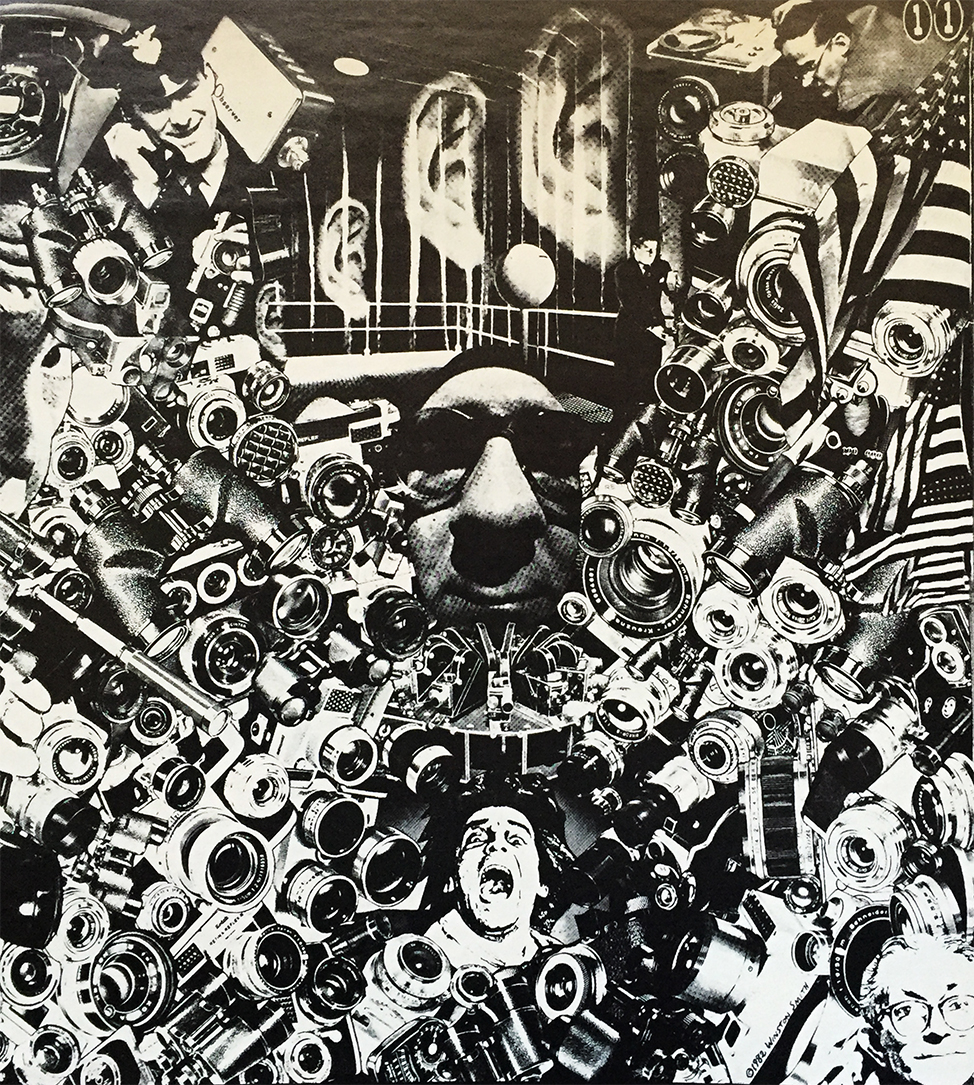 Winston Smith, surrealist master of the collage has some deep rooted connections to Dead Kennedys and Alternative Tentacles Records (since before both their inceptions). In addition to having designed both the iconic Dead Kennedy’s “DK” logo AND the AT Records logo, Mr. Smith’s art has also been showcased throughout many, various DK inserts, as well as a handful of Jello Biafra-related album releases. His art for the back of Jello Biafra with D.O.A.’s 1989 Last Scream of the Missing Neighbors was featured on the cover of The New Yorker back in 2000. Guess what just made my “want” list. This piece is another ocular gem found in the lengthy insert for 1982’s Plastic Surgery Disasters. TONS of amazing pieces in this insert which is, of course, definitely worth seeking out.
Official Winston Smith page can be found here.
WWIII
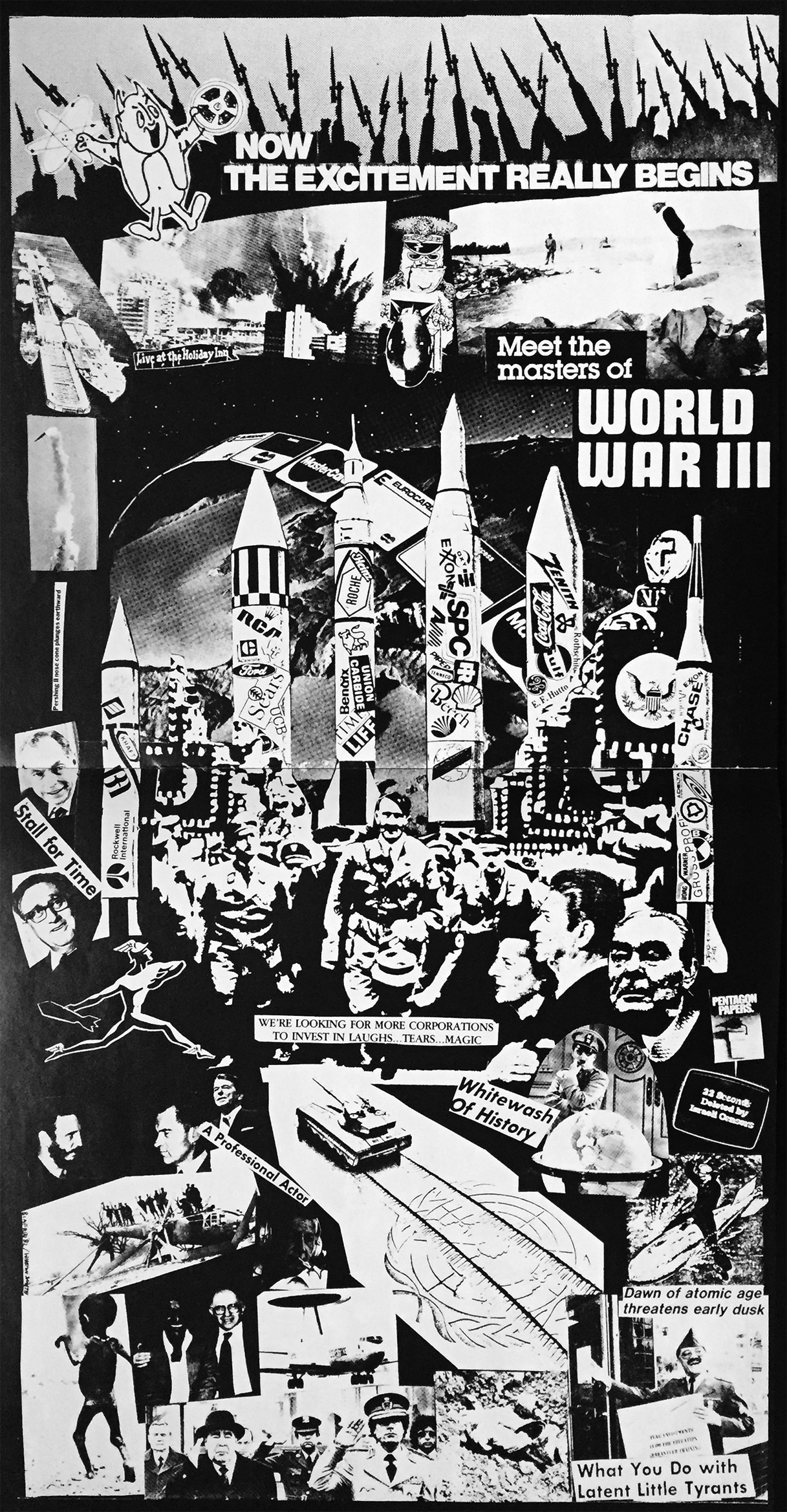 Welcome to 1984. Are you ready for the third world war?! So go the lyrics spewed forth by Jello (Wahoo) Biafra in 1981’s We’ve Got a Bigger Problem Now (not featured on the album in which this insert was showcased). The Crass-like art featured within the multi-page booklet from 1982’s Plastic Surgery Disasters by Bay-area social norm killers, Dead Kennedys, acts as a sort of a pictorial accompaniment to this amazing, yet sobering album. Pulling little to no stops, Mr. Biafra and team eject a string of disturbingly accurate observations on every day life back in Cold War 1982. Oh, how strikingly little things have changed some 33 years later. Anyway, enjoy the art!
We Are the Draught Beer Preservation Society
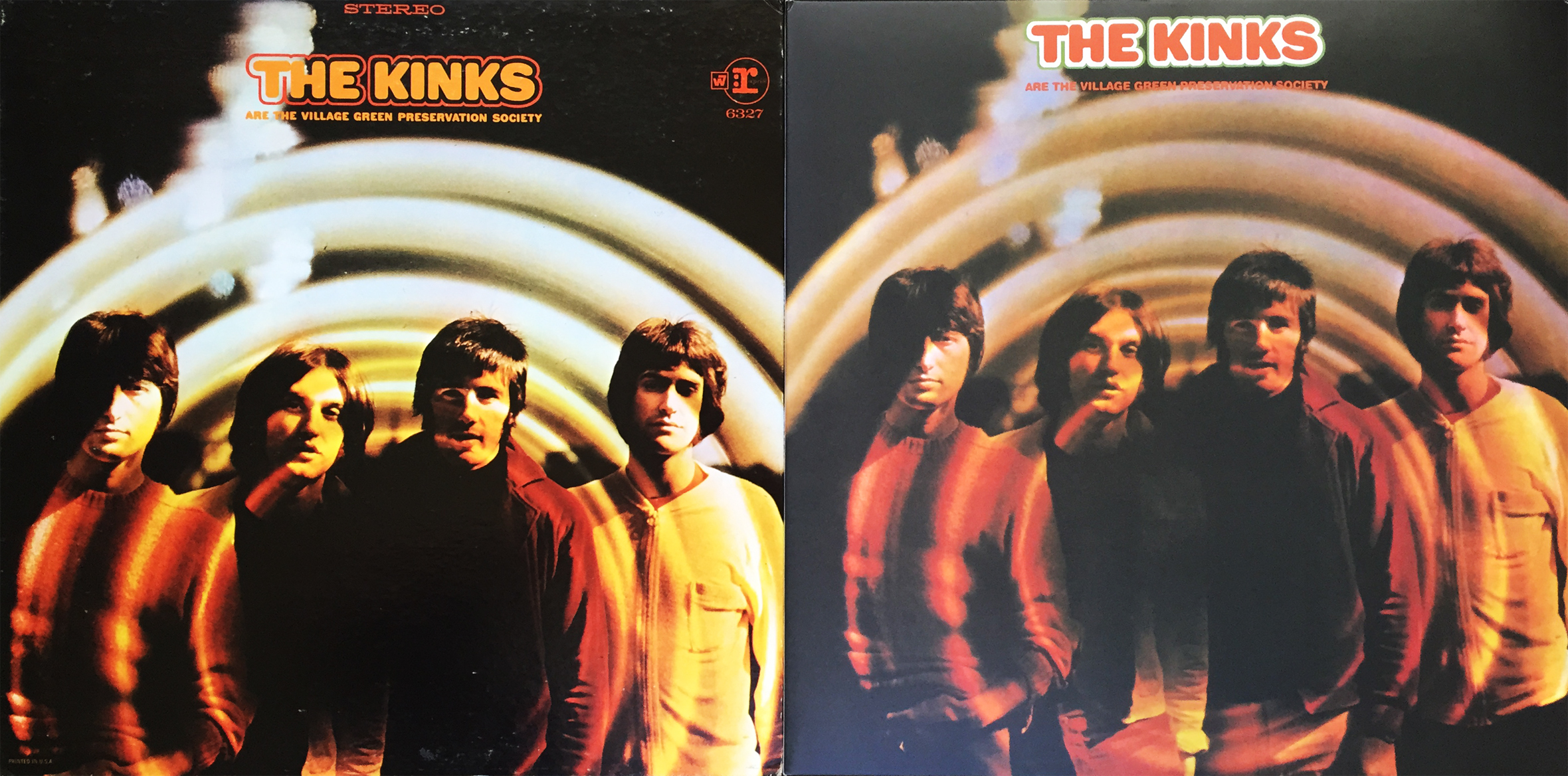 Sundays are for resting, so get off your computer and enjoy what’s left of your weekend. (On the left, the 1968 US Reprise Records pressing, and on the right, the 2011 UK Sanctuary Records double “orange splattered green” mono / stereo release.) God save the Village Green (and what’s left of your weekend)!
’82
 1982 was a good year for several, obvious reasons. The Dukes of Hazzard saw a bit of a ruckus when Warner Bros. refused to pay actors Tom Wopat and John Schneider their due royalties. This resulted in the Duke brothers’ 17-episode hiatus / protest. Warner Bros. finally struck a deal which finally ended the Vance and Coy era (“cousins” filling the lead rolls left vacant by two smart actors speaking up when they weren’t being paid what was contractually theirs).
Let’s see, what else happened… Tron, E.T., Tootsie and Blade Runner were released… The stupid-ass St. Louis Cardinals beat the Milwaukee Brewers in game 7 of the World Series… Grace Kelly, John Belushi and Ingrid Bergman died… I moved from sunny Southern California to the frigid tundra of Wisconsin… OH! And the Beastie Boys released their first record, a hardcore EP titled Polly Wog Stew.
 8 tracks released on both 7” and 12” formats, the Polly Wog Stew E.P. would be the first, last, and only official release from the band as a hardcore unit, next releasing Cookie Puss which saw the Boys Beastie bow more towards a new form of hip hop (well, at the time).
Yeah, ’82 was decent, and oh so long ago.
Seal of Quality, One Discovers
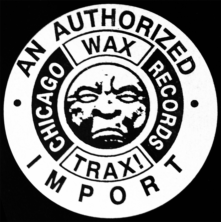 When one witnesses this 1992 seal of quality from the 1992 KMFDM album, Money, one knows one is witnessing one’s best possible selection one can possibly make. One need not continue looking once one discovers ol’ Moonface logo guy, here. One looks, one sees, and one gets that deep down warm and industrial fuzzy feeling one tends to get, when one knows, and respects, that Wax Trax! Records sound.
There can be only one, and this is it.
PG-13 Guns N’ Roses
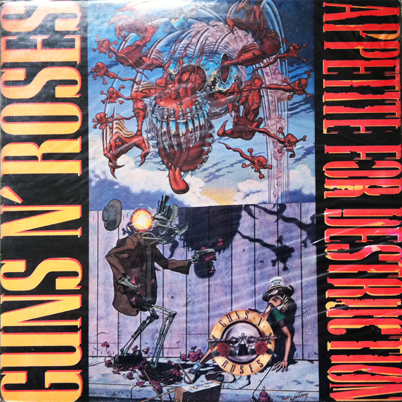 This South Korean version of GNR’s classic, Appetite for Destruction, features a PG-13 variant cover of the Robert Williams painting of the same name. The original, and banned, or discontinued cover was deemed offensive by some in South Korea, enough to warrant the GNR logo to be slapped over the questionable portion of the art.
With such precautions taking place in South Korea, one can only imagine the North Korean version would look identical to Spinal Tap’s Smell the Glove.
Off With Their Heads!
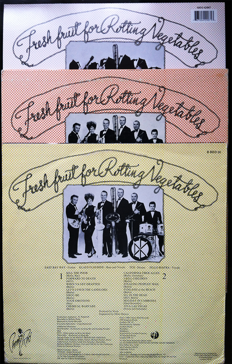 As the long-told, infrequently-forgotten story goes, the sunshine-happy-give-us-your-money band featured on the back cover of Dead Kennedy’s debut, Fresh Fruit for Rotting Vegetables was used without the band’s consent, and resulted in a threatened lawsuit causing variations of the Bay area’s backside cover art. LA-based Sounds of Sunshine (aforementioned sunshine-happy-give-us-your-money band), wasn’t quite satisfied with their work-around beheading, and the Dead Kennedy’s were forced to come up with a new back cover concept altogether (replaced the sunshine-happy-give-us-your-money band sans heads with four vintage living room-dwellers sitting under a framed Alternative Tentacles logo… subsequent lawsuit forthcoming).
If any morals are to be learned from this tug-and-pull fiasco, they are forever silenced by the timeless music contained within.
Drawings: Raymond Pettibon
 I broke the mold of tradition yesterday and removed the shrink wrap that bound my copy of Double Nickels on the Dime, the Minutemen’s timeless magnum opus. It has become habit for me to neatly slice the plastic along the sleeve opening, preserving the virgin cover, back, and in this case, gatefold center.
 I’d never owned Double Nickels in any format until I found this reissue, so I was more than amazed when I released the fruits of this gatefold for the very first time. Aside from the usual credits and a collage of action band shots are seven drawing by Raymond Pettibon I’d never seen before. Famous first throughout the Southern California early punk scene, then the world over, Mr. Pettibon’s art ranges from morally exposing to minimalist shock, which, after reading this again, does absolutely no justice to either the style of his characters, or the weight of his foreboding, and ominous messages. His often humorous take on the vulgar details of moral principles (many struggle their whole lives to ignore) raise a sense of loaded guilt that makes you want to go out and punch an elected official in the face, but you know… in a good way.