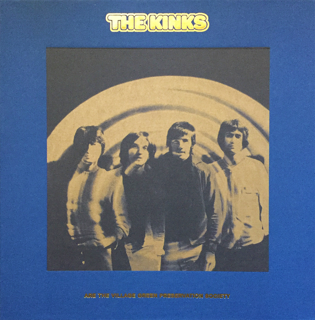
 Oh, dear Lord. The deluxe, 50th anniversary release of the coveted, and rarely eclipsed The Kinks Are the Village Green Preservation Society. I’ve been hesitant in posting my excitement about this long-awaited box set for dreadful fear of not properly providing it with the much-needed justice and attention it deserves. So with that, I’ll (with a shameful heart) postpone this journey for another, more appropriate date, safe to say, this box set was well worth the wait, and is well worth the price of admission.
Monthly Archives: March 2019
Columbia Records Every Music Lover Should Own
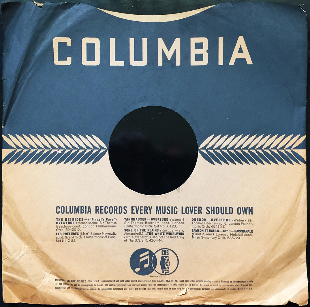 Do you love music? Do you OWN music? Why not take Columbia Records out for a spin and see how the night goes? Dinner is optional, if you know what I mean. Columbia Broadcasting System wants you (and your pocketbook) to indulge in some fantastic, and noteworthy releases via their vibrant, 78rpm catalogue. Featured here, on this 1930? protective sleeve are descriptions of releases by Sir Thomas Beecham, Lorenzo Molajoli, Choir of The Red Army of The U.S.S.R., and Selmar Meyrowitz, but most notably, fancy yourself a gander at this amazing (yet strikingly simple) layout, and the CBS “Trade-Mark” logo. Columbia?! Yes, Gloria… Columbia.
The Wild Ones
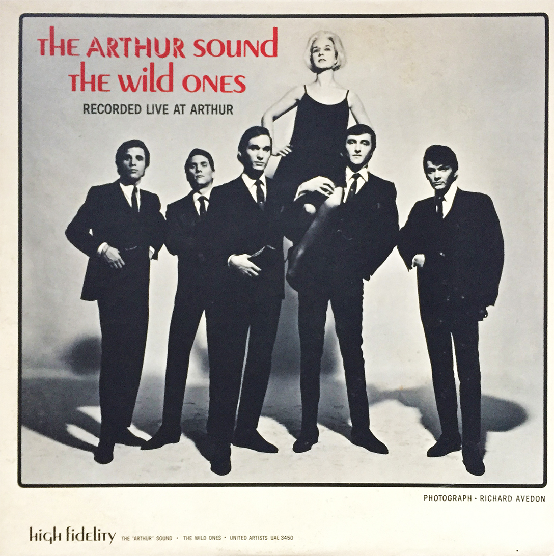 Here’s one for you, albeit short. So, Wild Thing, the intro theme to fictitious pitcher Rick “Wild Thing” Vaughn, as well as the number one charting single by English chaps, The Troggs (originally calling themselves the Troglodytes) was initially recorded by New York kids, The Wild Ones (unfortunately, the track is not featured on this album). The song was written by yankee songwriter Chip Taylor, who just so happens to be the brother of actor John Voight. The Arthur Sound, featured here, is a damn-good collection of live performances by this 1965 five-piece. Even though it doesn’t include the song previously mentioned, it’s lively, a bit feverish (for 1965), and makes for a great (mild) garage rock spinner.
“His Master’s Voice”
 We’ve all seen this iconic logo by the Victor Talking Machine Company, but did you know, rumor has it, or lore, really, that the original painting that inspired this historic logo (a direct lift, really) by English painter Francis Barraud has a bit of a heartwarming backstory. Sure, a questionable yet awe-inspiring story will certainly help you sell records, so take it with a grain of sentimental salt. Apparently, Francis’ brother Mark had passed away, and Francis inherited his brother’s dog Nipper, a terrier, along with a a cylinder phonograph (Edison, anyone?) and some cylinders with poor, deceased Mark’s voice on them. When little Nipper, as the story goes, would listen to his departed master’s voice projecting through the vibrant horn, he / she would peer at it with inspirational interest, spawning Francis to paint the iconic piece in 1899… but this time (suck it, Edison!) with a disc machine instead of the original cylinder apparatus, and the rest, as they say, and is clearly known, is history. Check out the painting and rogue history on Wikipedia. The photo above was taken, by me, from a recently acquired 78 sleeve, printed some 80-90 years ago. The more you kinda know?
Clarion 78
 Another vintage 78 sleeve?! K’mon, man! Nope! I’m owning this! Clarion Records, whose logo owns a striking resemblance to the classic Grand Royal Records logo (one of them, at least), was home to such (who the hell are they?) artists as Ford Britten’s Comets, Eddie Younger’s Mountaineers, Louisiana Collegians, and Hobo Jack Turner (among many, many others). Predominantly active throughout the early 1930s, releases on the Clarion label are many, which is odd considering little to nothing about the label’s history can be found online. The logo is tops, though!
Hell and Back
 First off, RIP Jam Master Jay. Secondly, back covers, or as I like to call them, album ass, can be just as enticing and worthy of discussion and attention as their popular fronts (in my humble opinion). Case in point, this lovely, squared-off, rear-end of Run-DMC’s 1986 Raising Hell. Bold, yes. Informative, sure. Track listing is a huge plus. Credits, both artistically and manufactoringly (sure, a bit of a stretch, but we’re going with it), are all present and accounted for. This is a monster album, worthy of ownership by just about anyone with good sense, and if you don’t already own it (which I’m sure you do), it’s certainly worth seeking out.
Pickwick
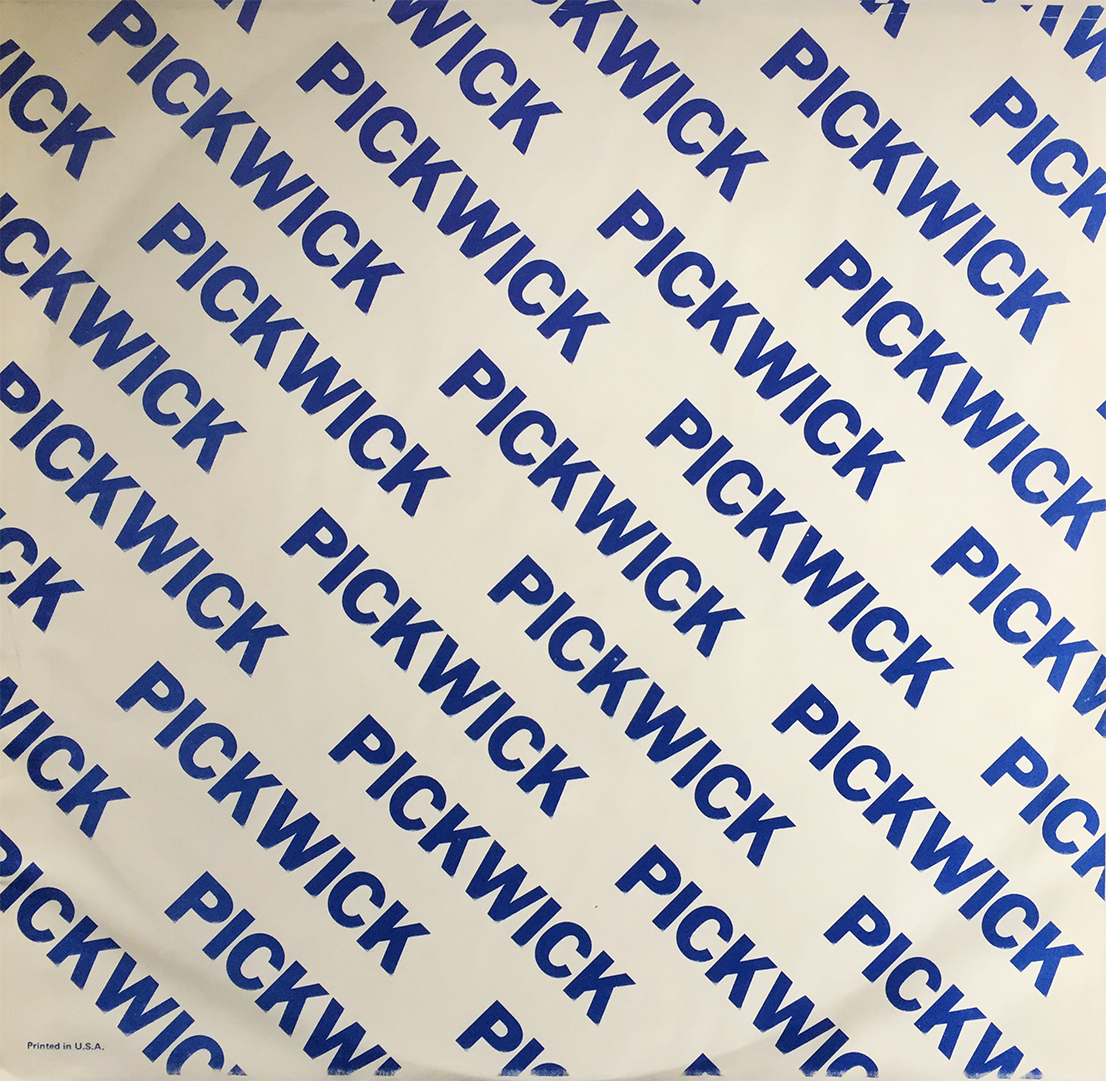 Ok, let’s jump ahead a few decades (four or so) and revel in the artistic advancements of well-designed record sleeves. Pickwick (as cheap of a product as they were… sorry, Pickwick), certainly took the overly simple approach to bold and effective measures. This pattern would make for some bomb wallpaper (desktop or otherwise), and I’m now thinking of lifting this look for some Groove-related goodies. Anyway, sleeves-a-plenty over here these days, so buckle up and enjoy the obscurity.
VTM 78
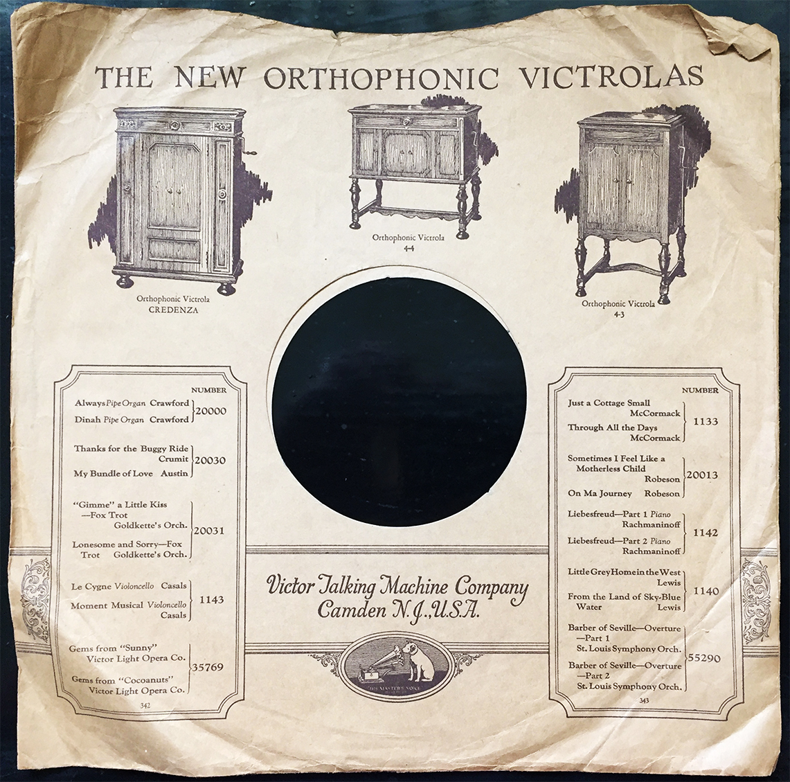 Sleeves advertising vintage record players (or in this case, classic Victrolas), are some of my favorites to discover. They’re not always in heavy supply, the sleeves, so when they rear their beautiful and fragile heads, it’s a bit of a pleasant surprise. That credenza looks pretty badass, in my humble opinion (again, the space issue), but to be honest, accurately reproduced sound has never looked so damn sexy.
