 In lieu of today’s biggest release in the history of Columbia Records (which is an argument to be had, I know), I present a simple, yet elegantly designed sleeve from 196?
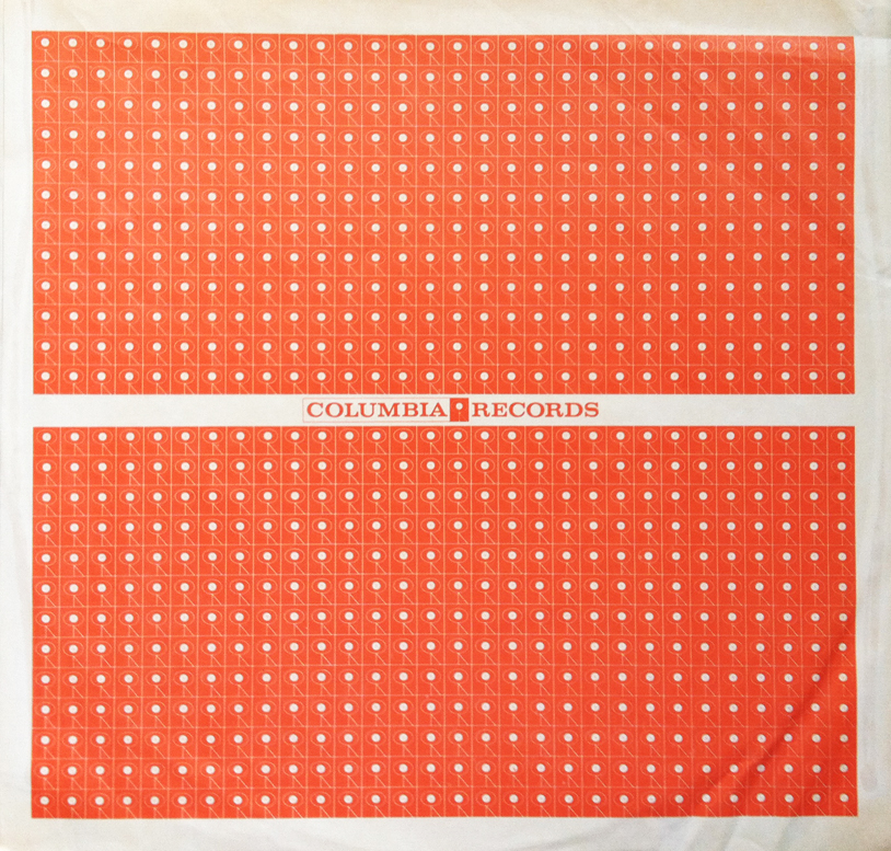
Using repetition, and a simple (not to mention inexpensive) two-color layout, the designers at Columbia Records produced an elegant piece of 1960’s design in the often hidden form of a protective record sleeve.
As you can plainly see, the Columbia Records logo is subtly patterned on either side of the centered, Columbia Records name. There is no question that a bold white line amongst a sea of orange logos was designed specifically to demand attention from the eye, and only after you’ve read the text do you realize the tiny logo creating the hemispheric patterns.
If you haven’t already, go out and pick up a copy of Daft Punk’s Random Access Memories. When you leaf through the futuristic (2013) album, think back to the mountainous Columbia Records catalog, and how simple, yet tasteful, their design (and musical) history was.
